

面积图(Area Charts)天然适合描述总体与各成分的数值是如何随时间推移变化的。但是在大多情况下,这种图并不容易阅读。
这篇文章将讨论面积图的使用场景、限制以及如何改进。
声明:本文是专题《数据可视化的最佳实践》的系列文章,内容摘自 Datawrapper Blog,著作版权由网站及其作者所有。I. 何时该用面积图?
When to use area charts?
TIPS 1:仅当展示随时间变化的数据时
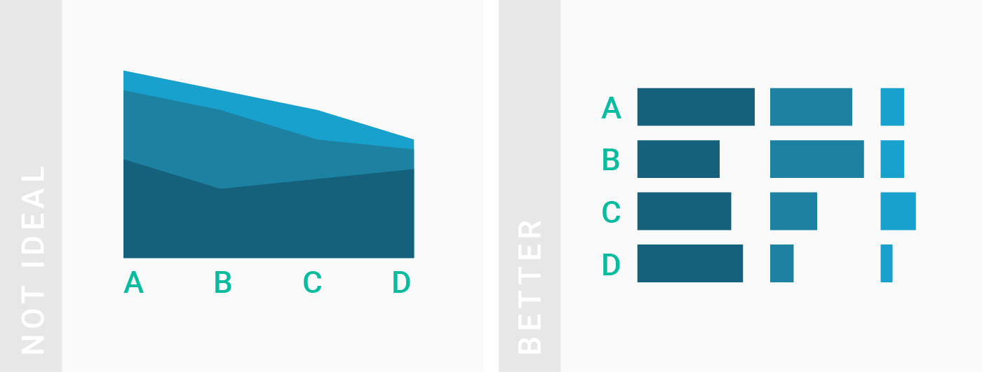
如果想要展示各种类别下不尽相同的数据,最好用条/柱形图(也可以是堆叠的)。
Use area charts only if you want to show how values develop over time. If you want to show how values differ in different categories, consider a (stacked) bar, column chart or split bars instead.
TIPS 2:个体与总和同样重要的时候
如果总和(即柱形图的高度)并不是很重要(特地强调),应该用线形图代替,毕竟这种图天生比较适合时间序列的展示。然而,一旦各部分的总和都是 100% 的时候,就要马上想到面积图这种更直观、可读的图像。
Area charts work best if the total is as important as its shares. If the total (= the height of all your stacked areas) is not important, consider a line chart instead. Many readers will have an easier time understanding a line chart than an area chart. However, if your values for each date add up to a total of 100%, an area (or stacked column) chart might still be the most intuitively readable option.

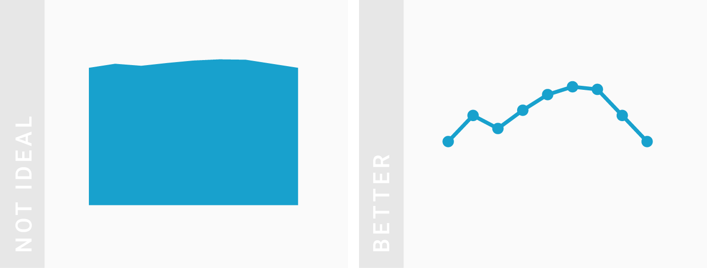
TIPS 3:各项数值差异较大的时候
如果数值的差异本来就很小,那么不如使用线形图。相比之下,线形图可以让任意伸缩纵轴,更加灵活,更能够比较数据的细微差距。
Area charts work best for considerably large differences between your values. If the differences between your values are very small, consider a line chart instead. Compared to an area chart, the y-axis of a line chart doesn’t need to start at zero. This means that your y-axis can be stretched to show the tiny differences.

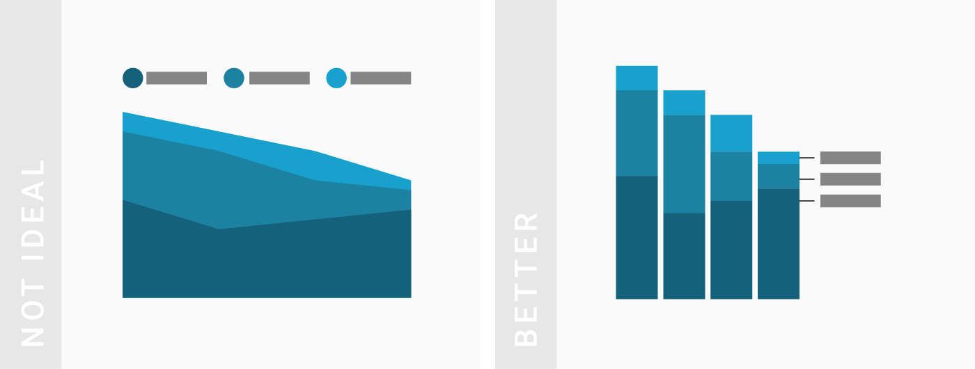
TIPS 4:展示随时间变化的数据(时间序列)
如果时间跨度小于 10 ,使用堆叠柱状图可能会更好。
Area charts work best if you have many dates. If you have less than ten or so dates, consider a stacked column chart instead.
TIPS 5:展示多组随时间变化的数据
对于不是必要展示多种变化数值的情况,使用线形图(一组数据)或柱形图(少于 3 组数据)更合适。
Area charts work best to show multiple values over time. If you just want to show one value over time, also consider a line chart instead; especially if you don’t want your y-axis to start at zero. If you only have a few dates, you can also consider using a column chart.
TIPS 6:不用于比较数值差异
如果需要展示一组数据超过了另一组,可以考虑使用线形图。这么做还有个好处是,不用把所有值都展示出来。
Area charts are not the best choice if you want to compare the size of different shares with each other. If you want to show that one share overtook another one, consider a line chart instead. One extra benefit is that you don’t need to show all the shares.

II. 怎样制作更好的面积图?
How to create better area charts?
P.S. 其实大部分和线形图(Line Charts)应该遵循的原则是一样的。
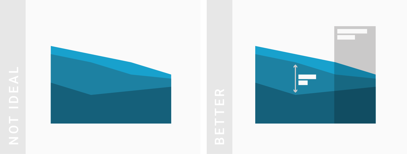
TIPS 1:把最重要的数据放在底部并上色
把数据放在底部,有助于读者更迅速比较数据。
Bring the most important value to the bottom of the chart and use color to make it stand out. Your readers can compare values easier with each other if they have the same baseline.

TIPS 2:不要自动调整标签位置
Consider turning off automatic labeling and place the labels yourself.
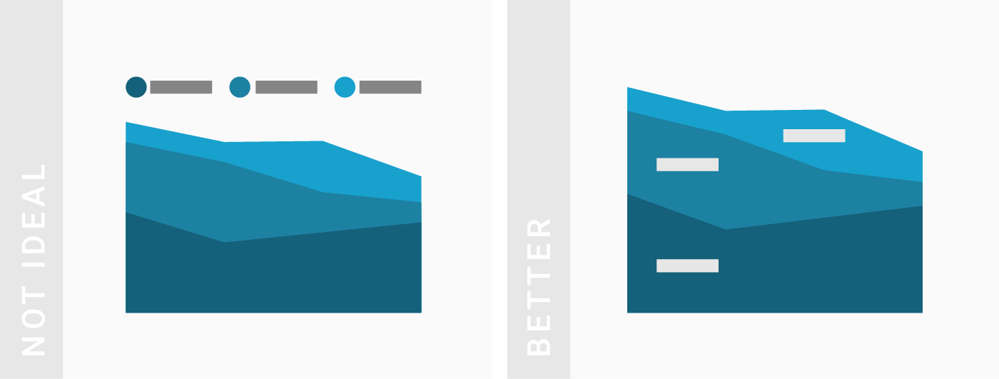
TIPS 3:借助批注和线框来增加说服力
Consider using annotations and highlight ranges to add explanations to your charts.
TIPS 4:合并小份额数据到一个标签(如「其他」)
Consider grouping tiny parts together into one bigger part (e.g. “others”) to clean up the overall look of the chart.