我们通常会把「图」和「表」连在一起,读作「图表」。那表格是可视化吗?如果是,数据是怎样被可视化的?如果不是,可以代替可视化吗?
表格虽然属于图形的一种,在有些时候,表格往往要么与数据可视化相近,要么被用来代替数据可视化。但是严格上说,在“如何使数据变得更直观、生动以及富有含义”的层面上,却比可视化差了那么点意思。下面我们将讨论什么时候用表格代替可视化,以及如何改进表格设计。
声明:本文是专题《数据可视化的最佳实践》的系列文章,内容摘自 Datawrapper Blog,著作版权由网站及其作者所有。I. 何时该用表格?
When to use tables?
TIPS 1:展示具体数据的时候
事实上,大多数人不会阅读整张表格(尤其超过 3 行的时候),只会看他们感兴趣的数据。
Use tables if you want to enable readers to look up specific information. In fact, most people won’t read a whole table (especially if it’s made out of more than 3 rows) and instead only look at the data they’re interested in.
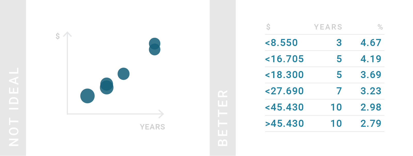
TIPS 2:展示一组数字或一种模式的时候
如果表格太长,读者可能在接触到最重要的数据之前就打退堂鼓了。这时候,图像比表格更能概括整体的情况。
Use charts instead of tables if you want to give an overview of your numerical data or show a pattern. If the table is long, readers might give up before they get to the most important values. Charts, however, show an overall picture.
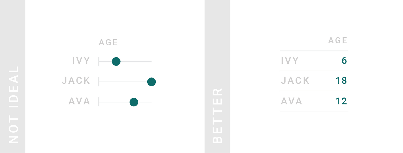
TIPS 3:需要保持数字精度的时候
大多数情况下,精确的数字对决策很重要。
Use tables if precise numbers are important. Precise numbers matter for decisions, so consider showing them to the reader.
TIPS 4:大多数情况下,人们还是习惯于阅读
如果并不对数据抱有强烈看法,就应该用表格来展示你的数据。我们很多人更喜欢阅读真实的数字,而不是欣赏一些视觉元素。
Tables are great for data we’re used to reading. Consider showing data in a table instead of visualizing it every time your reader might have a strong idea about the data. Many of us prefer to read with actual numbers instead of visual elements.
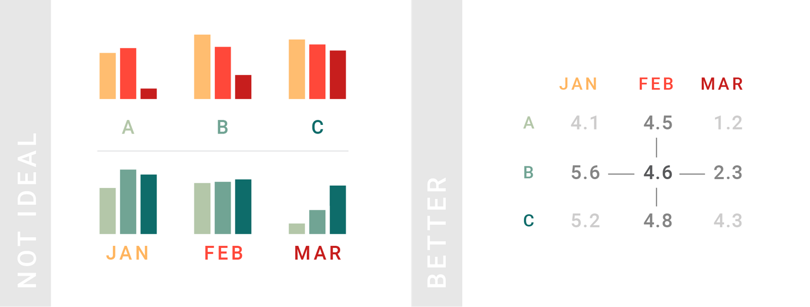
TIPS 5:要从不同方向比较数据的时候
Tables work better than charts if your readers should compare data in two directions.
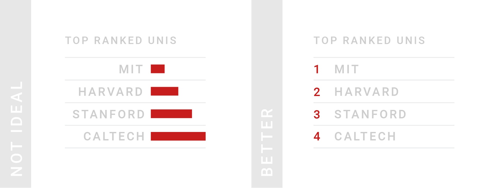
TIPS 6:展示排位(等级)的时候
等级是一种特殊的数字:在等级中,1 的意思并不是只有 2 的一半好,而是“某种意义上的好”。如果将等级可视化,可能会产生这样的误解。
Tables are great for showing ranks. Ranks are special numbers: 1 doesn’t mean half as good as 2, but “somehow better”. Visualizing ranks might support that false reading.
II. 怎样制作更好的表格?
How to create better tables?
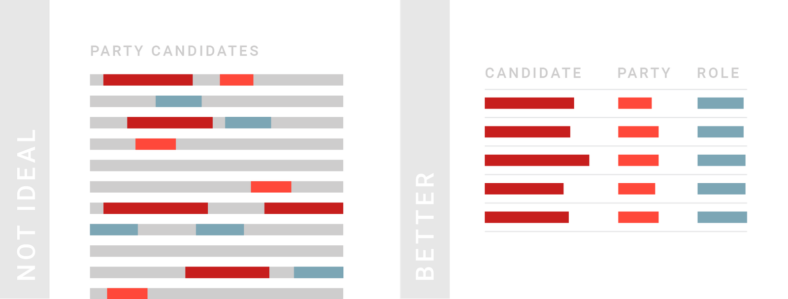
TIPS 1:把列宽尽量缩小
缩小列的方式包括,使用图标、简称,或者将重复出现的值作为表头(行转列),或者采用简化的数字形式(例如以 1M = 10^6 为单位 1,200,000 用 1.2M 表示,或保留小数 0.1129302 为 0.1)。
Consider narrowing (down) your columns. Use icons and abbreviations, bring repeating words in the column header and use a shorter number format or rounded numbers (like 0.1 instead of 0.1129302).

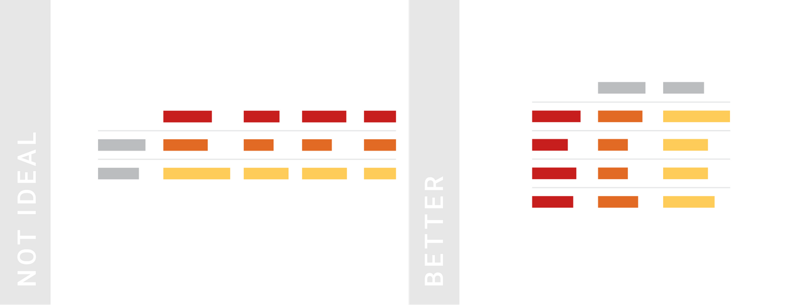
TIPS 2:行数多好过列数多,因为人们更容易浏览垂直排列的信息
交换行和列(转置)是一个减少列数的方法。
Consider structuring your data so that your table has more rows than columns. One possible way to reduce the number of columns is to swap rows and columns. Humans find it easier skimming through the information that’s vertically aligned, not horizontally.
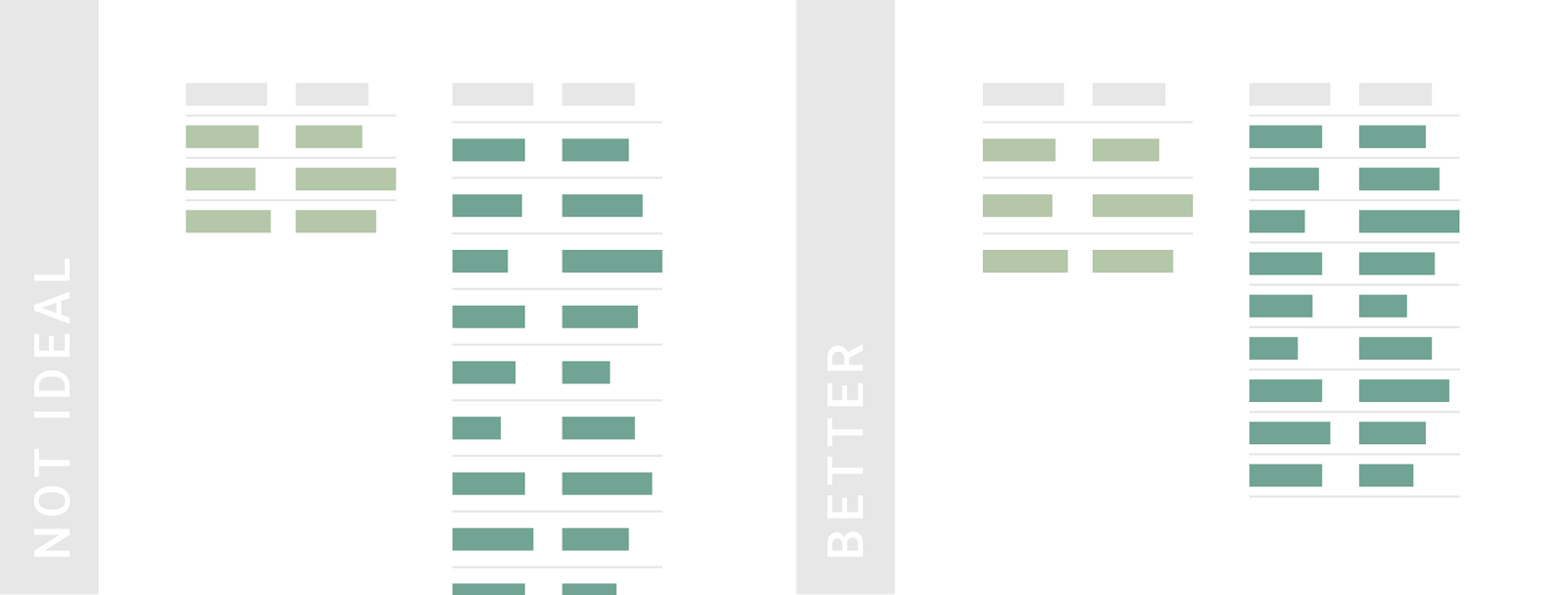
TIPS 3:当表格行数很多时,可以采用灰白相间的条纹(也被成为“斑马线”)
Consider grey stripes for long tables with many columns. If you can’t avoid many columns, stripe every second row with a light grey (also called “Zebra Shading”).

TIPS 4:根据表格的行数来调整行高
如果表格只有区区几行,行高更大更赏心悦目;如果行数非常多,紧凑的布局可以在同一视野下显示更多的数据。
Consider adjusting the row height to the number of rows. If you show only a few rows, a wide layout is more pleasant to the eye. If your table has a lot of rows, consider a compact layout that shows more data in the same available space.
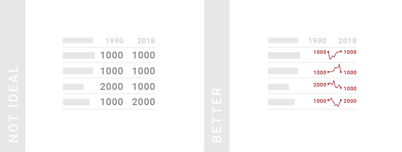
TIPS 5:对于时序数据,最好能够可视化表现它的发展情况,而不仅仅是展示起始点的情况
这种可视化的图形称为“火花线”。不过要记住,火花线并不要求 y 轴一致,因此只能用于展示各自趋势,而不用于彼此之间的对比。如果要比较,请用线图代替。
Consider showing development over time instead of just data from two or three time points. For example instead of showing just two years, you can show how something developed in-between with mini line charts called “Spark Lines”. Because of the limited space, the y-axis range is different for each Spark Line by default, so keep in mind that they only show a general trend but are not comparable with each other. If a consistent y-axis range is important for your data, consider a line chart instead.
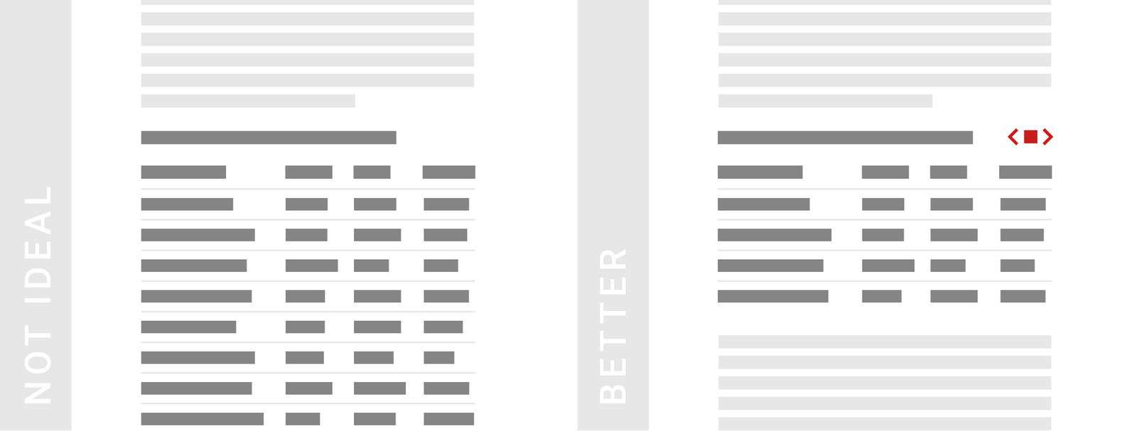
TIPS 6:对长表格进行分页
表格分页,不失为一个留住读者的好方法。
Consider pagination for long tables. A good rule of thumb is that the table should be shorter than a desktop screen if you don’t want readers to miss the fact that your article continues below it. Turn on the pagination feature of a long table to make readers aware that they haven’t reached the end of the article yet.
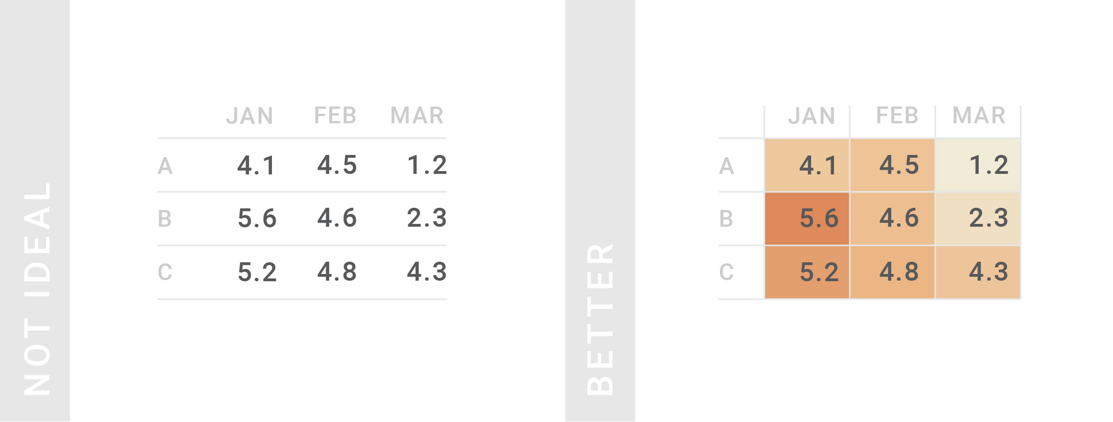
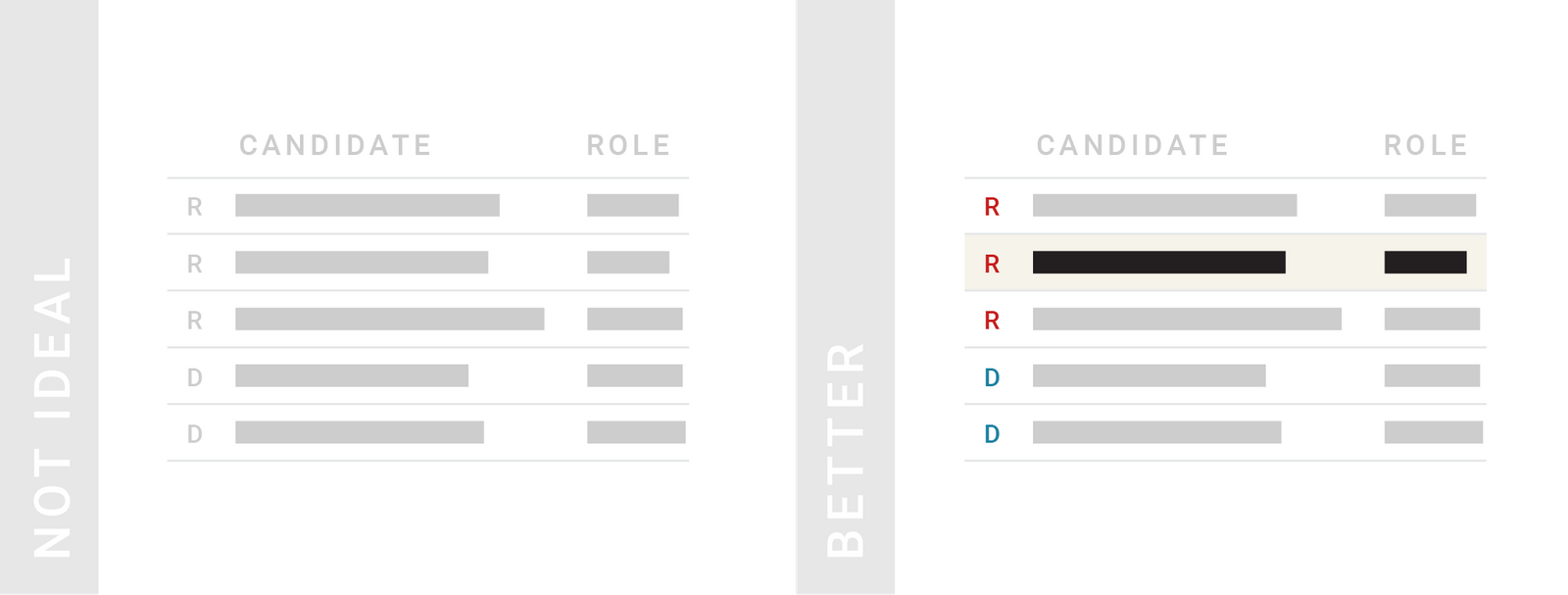
TIPS 7:善于给表格着色
颜色是强大的工具,可以凸显更重要的信息,来引起读者的注意。因此,请不要吝啬颜色工具,给不应错过的行和列着色。着色时,文本(前景)要用亮色,单元格(背景)要用柔色。
Use colors to lead the reader’s eye to interesting information & help them navigate the table. Color is a powerful tool to make more important information stand out: Use it to highlight columns or rows that readers shouldn’t miss. When coloring text, consider bright colors. But when coloring whole cells, rows or columns, choose pastel background colors.
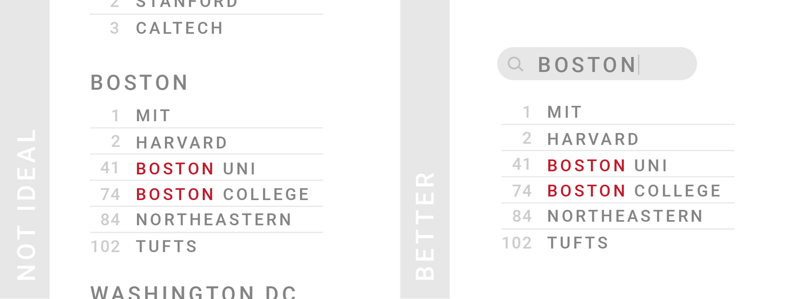
TIPS 8:好的表格应该是可检索和排序的
由于数据的作用总是相对的,可能对于一些人来说比较符合(他们的要求),而对于另一些人却是未必。因此,最好能够给读者提供搜索或排序的选择,这样他们会更懂得怎样更好地使用数据。
If your table contains information which is more relevant to some readers, but less relevant to others, consider making your table searchable & sortable. A solution that will take away only a bit of space is a search field. Enabling readers to sort columns is another way to let readers decide how to best use your table.
TIPS 9:研究数据的排序方式
表格越长,就越需要考虑清楚组织数据的呈现顺序,尤其是分页的时候。大多数情况下,优先给数值类型的列排序。如果不确定到底哪些数据是需要排序的,那就给读者保留自定义的方式。
Put some consideration into how your table is sorted. The longer your table, the more thought you should put into the order of your data; especially if your table data is paginated and therefore most of it is hidden. Enable custom sorting if you’re not sure – but consider that custom sorting can make some tables unreadable.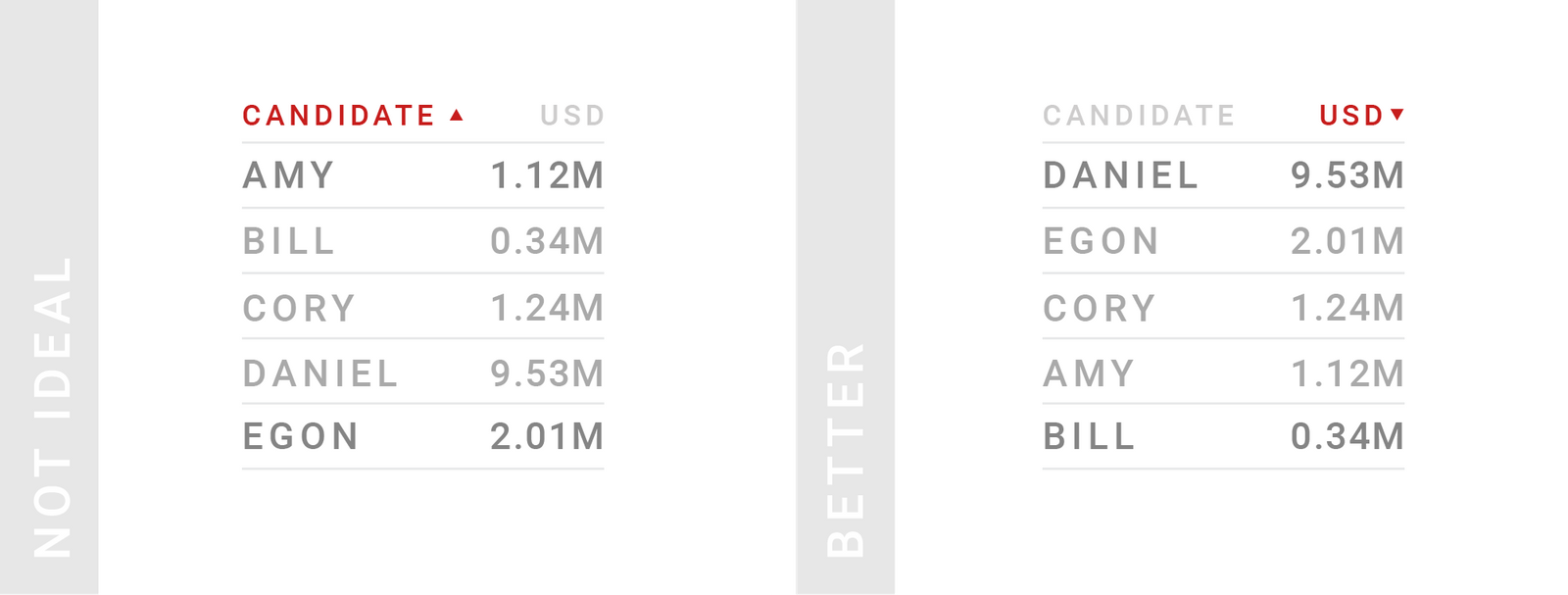
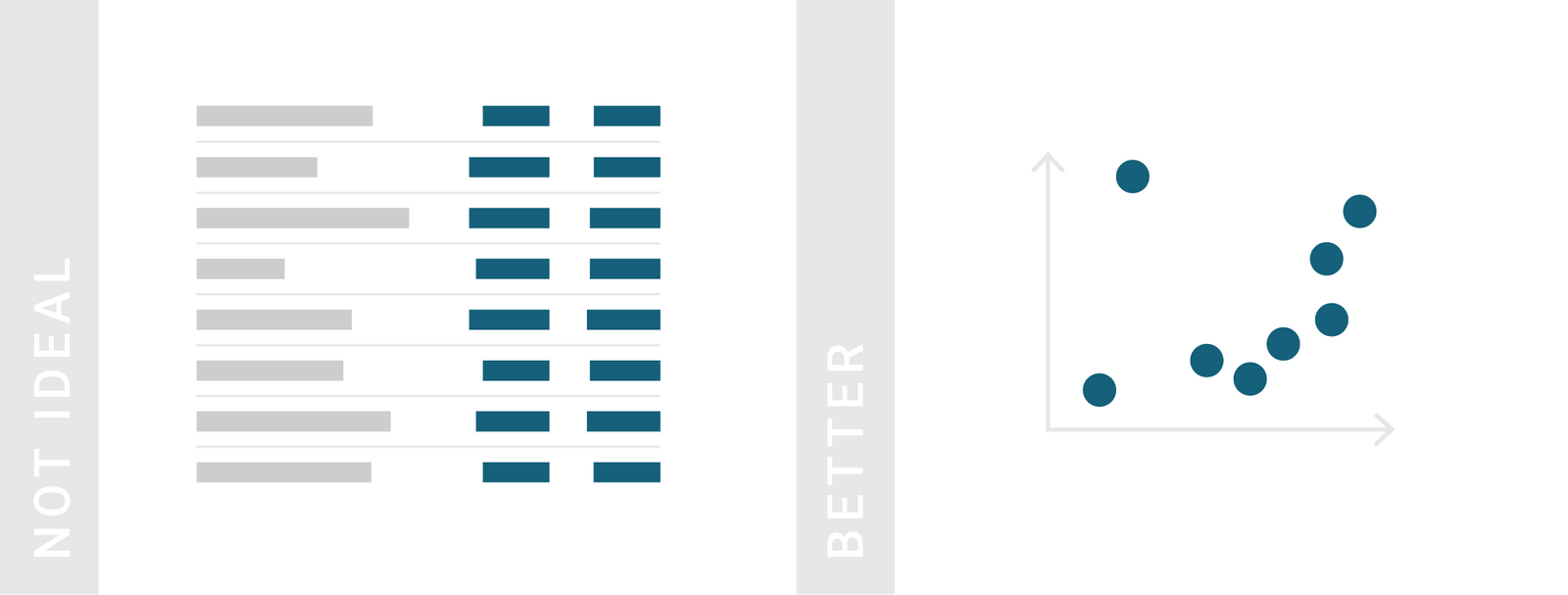
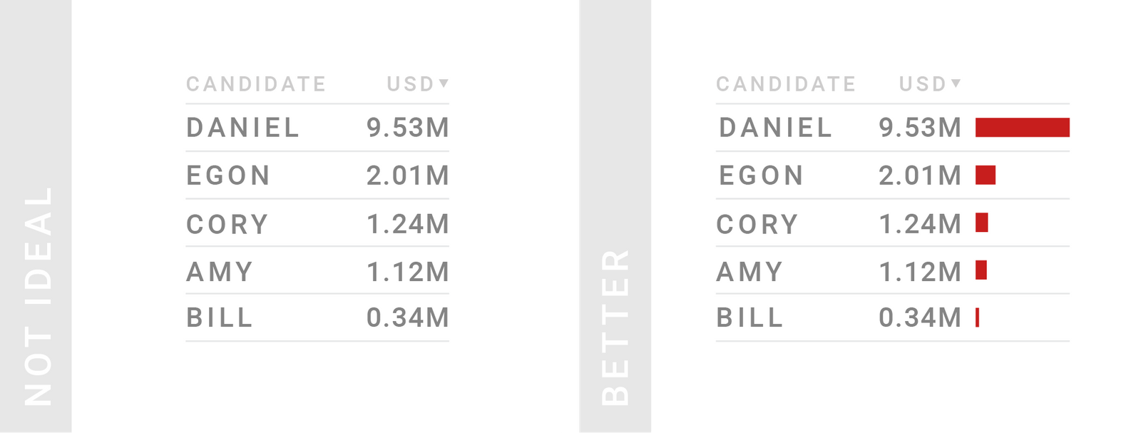
TIPS 10:如果列数很少,可以考虑数据可视化,例如使用条/柱形
这么做可以使得表格既有序又直观,让读者快速了解你的数据。因为可视化会占据更多的列宽,为了不影响表格的可读性,只针对最重要的一列数据可视化就行了。
Consider visualizing your data with bar charts. Often, we can combine the best of both worlds – the readability & sortability of tables, and the quick overview of our data that charts offer. But showing your data as bars will often make your columns wider than a normal number column. So consider showing bars not for each of your number columns, but only the most important one(s).
TIPS 11:使用热力图来展示同一尺度/口径(例如单位)的数据
适合用热力图展示的表格有:相关系数矩阵、相似度矩阵、距离矩阵等。
Consider visualizing your data with heat maps. If you have more than one column with the same measurement, applying one color gradient to all columns is most intuitive.