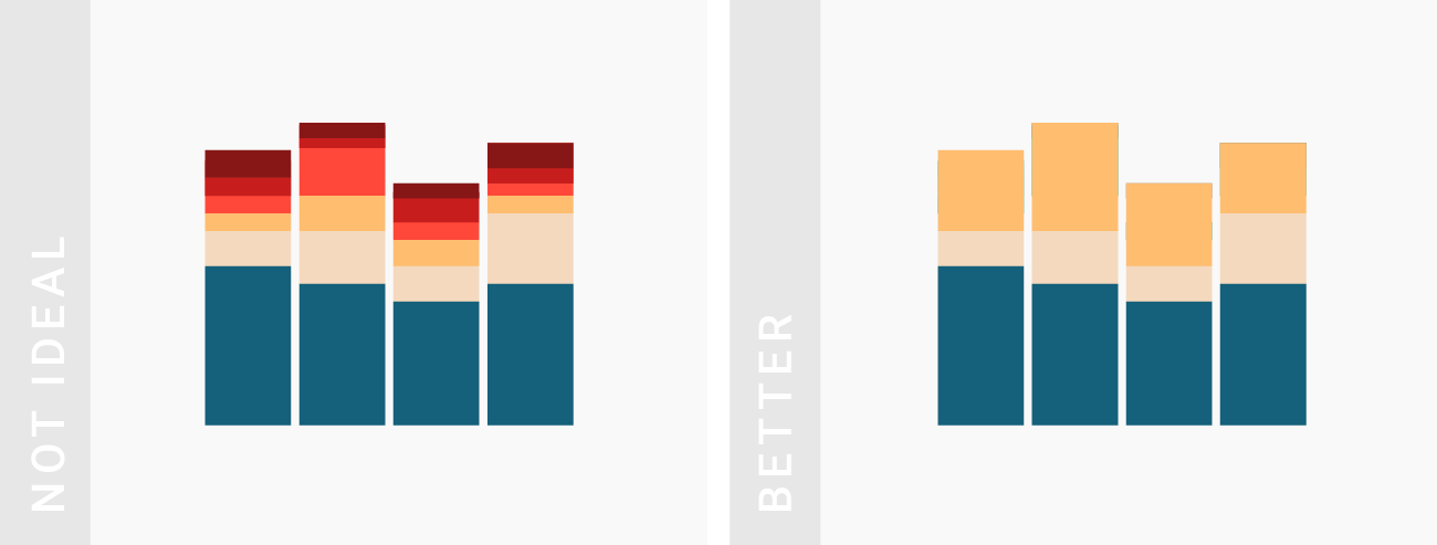

像面积图和饼图一样,堆叠条/柱形图(Stacked Column Charts)也很适合用来展示部分和整体的关系。
下面我们将讨论这种图的使用场景以及如何改进。
声明:本文是专题《数据可视化的最佳实践》的系列文章,内容摘自 Datawrapper Blog,著作版权由网站及其作者所有。I. 何时该用堆叠柱形图?
When to use stacked column charts?
TIPS 1:当总体值很重要的时候
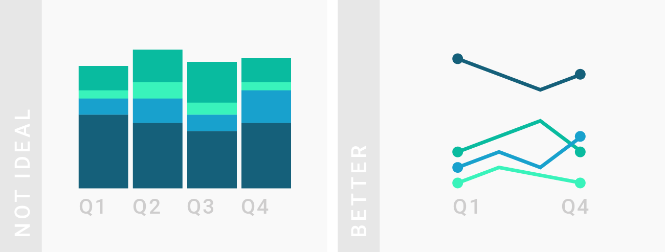
堆叠柱形图虽然很适合时序数据,但是也只有当总体非常重要的时候才应该考虑。如果总体值并不那么重要,线形图是更好的选择,因为它可以让人更快地解读数据。
Stacked column chart can work well for dates, but should only be considered if the total of your parts is crucial. If the total of your parts is not important, a line chart is a better choice. It can be quicker decipherable by your readers.
TIPS 2:展示多个总体值的时候
如果只想总体中的某一部分,应该用柱状图代替。它既比堆叠图更省空间,又更好地反映各部分之间的关系。
Stacked column charts are great to show the parts of multiple totals. If you only want to show parts of one total, consider a bar chart instead. It will use your available space better than a stacked column chart. In addition, readers will be able to compare the parts better with each other.
TIPS 3:总体数量较少的时候
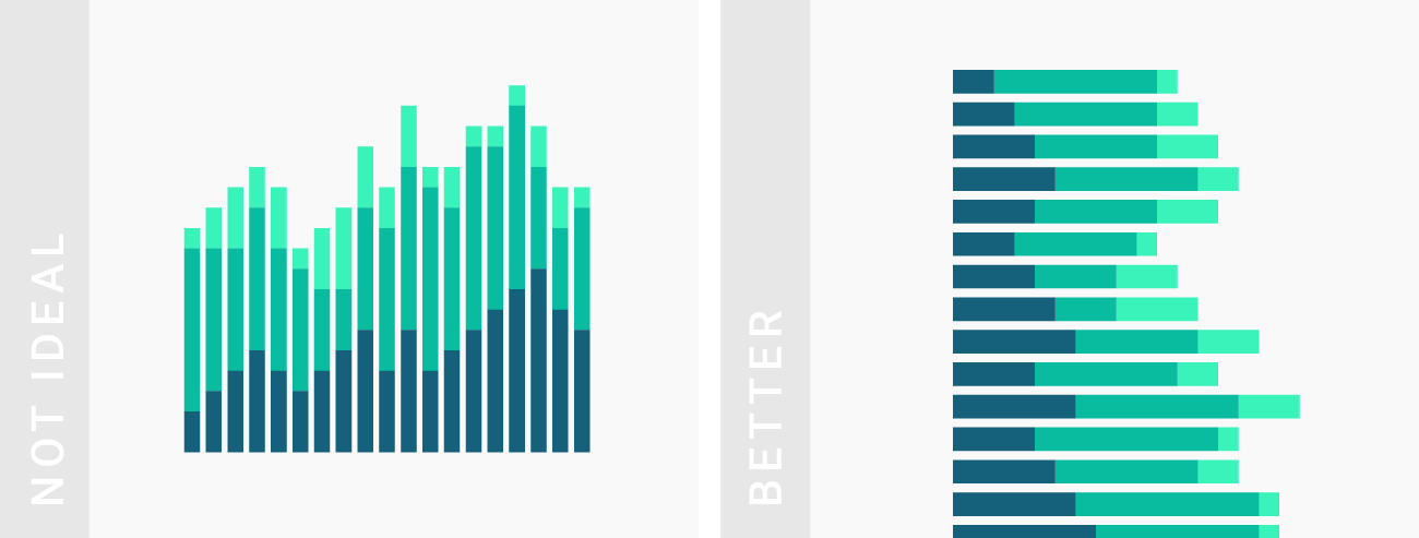
堆叠柱状图展示有限总体,尤其是少于 10 个(总体内成分也不能太多)的时候最好。如果非要展示,考虑用堆叠条形图或其他能够纵向展示数据的图像。
Stacked column charts work well for only a few totals. If you have more than approximately 10 bars (and not so many parts for each total anyway), consider a stacked bar chart or other chart types that display data in rows.
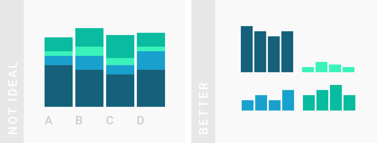
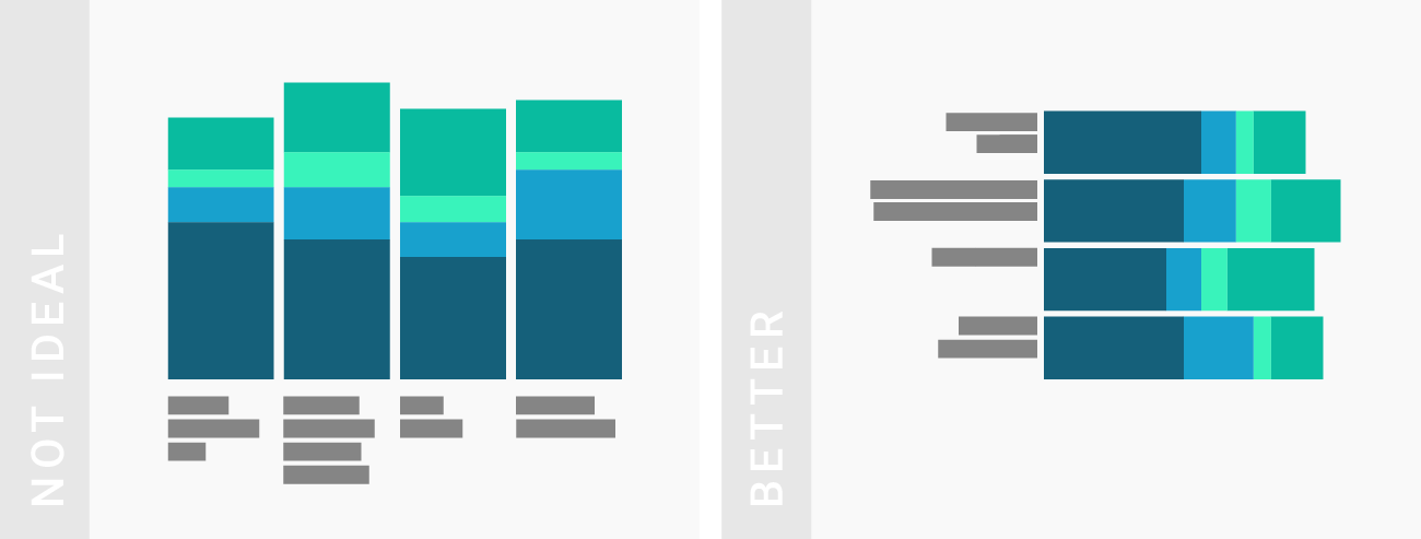
TIPS 4:比较个体与总体的差异时
读者往往很难比较不在同一基准(起始水平)的数据,所以如果要关注并比较各部分的情况,请将各成分拆解用条形图代替。
Stacked column charts work well when the focus of the chart is to compare the totals and one part of the totals. It’s hard for readers to compare columns that don’t start at the same baseline. If the focus of your chart is to compare multiple parts across all your totals with each other, consider split bars or small multiples instead.
TIPS 5:需要比较各成分值的时候
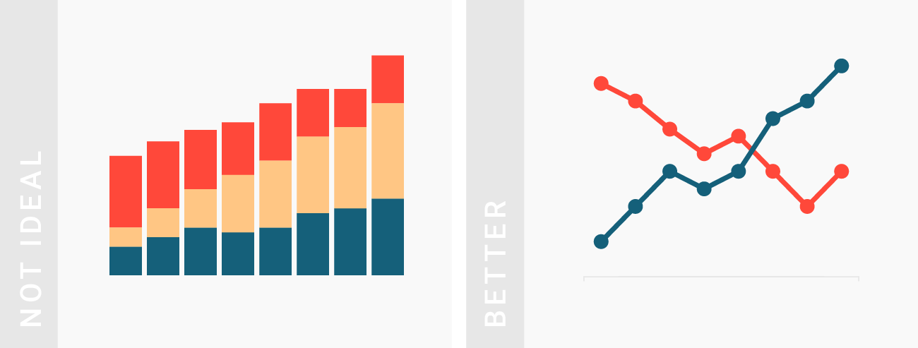
如果不是,考虑一下用线形图代替堆叠柱形图来表达一组数据超过了另一组。这么做可以避免读者直接看见(并不重要的)总体情况,立意更清楚。
For time data, also consider a line chart if you want to show that one share overtook another one. Readers won’t see intuitively that the chart is about parts of a total anymore. However, you will communicate your message more clearly and don’t need to show all the shares of the total to do so.
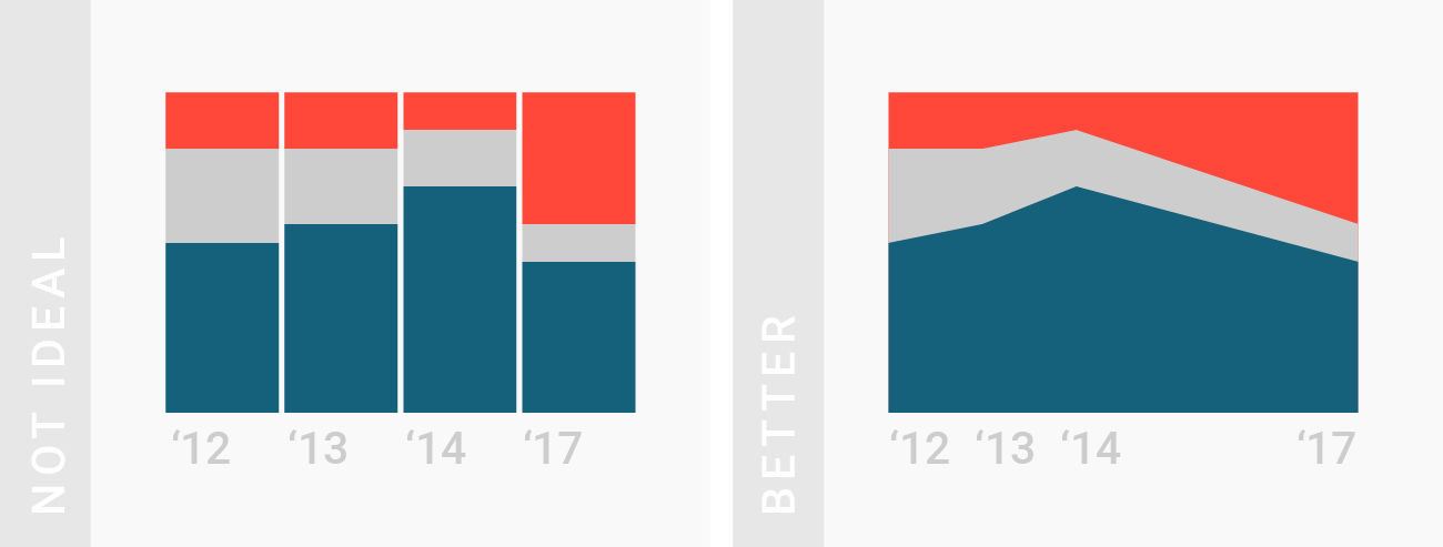
TIPS 6:展示时间少、间隔一致的时间序列
一般的条/柱形图适合展示种类比较少的数据,太多了就会影响阅读(实际上变成了分布图)。堆叠柱形图也是如此。不过,仍然要注意这种图仅限于总数很重要的时候(TIPS 1)使用。如果不满足以上任一条件,最好还是用面积图(或者线形图),因为它们的横轴刻度是连续的,能够正确显示时间间隔,避免引起曲解。
If you want to use stacked column charts for time data, make sure your dates have the same intervals. If you want to choose between area charts and stacked column charts, then the latter one is a better choice if you only have a few dates. Readers will be able to compare the parts of the totals better with each other than on an area chart. However, if the intervals between your dates are different, use an area chart (or line chart). They have x-axes with continuous scales that will show the date intervals correctly.
TIPS 7:(如有必要)使用尽可能短的数据标签
堆叠柱状图的标签要简短,不然不如用堆叠条形图更好。
Stacked column charts work well when totals have short labels. Consider a stacked bar chart instead.
II. 怎样制作更好的堆叠图?
How to make line charts better?
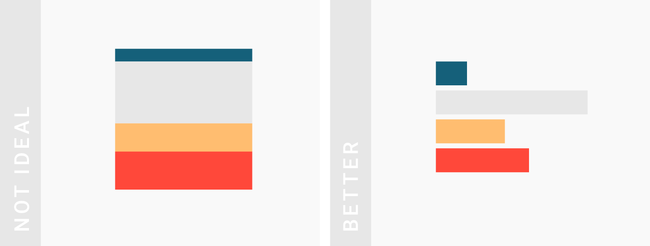
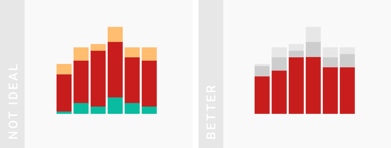
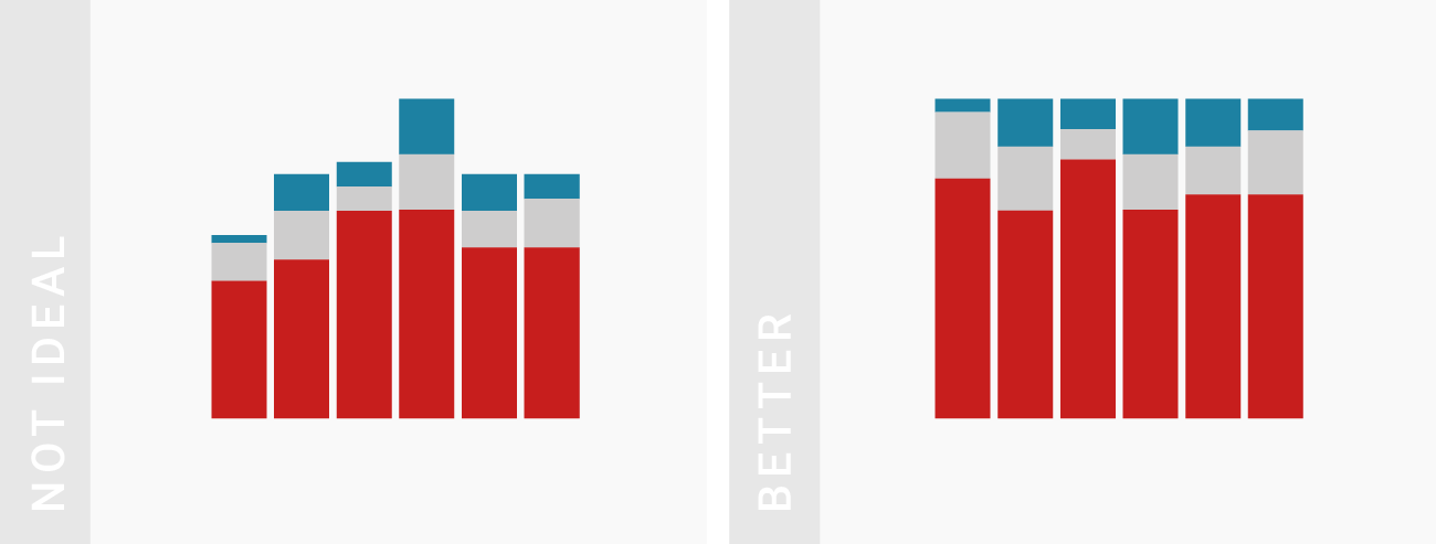
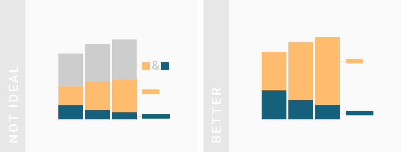
TIPS 1:给最重要的数据上色并放在底端
Bring the most important value to the bottom of the chart and use color to make it stand out. Your readers can compare values easier with each other if they have the same baseline.
TIPS 2:将数值转成百分比(这样每部分的和都是100%,显得更整齐)
Consider stacking percentages (so that every total will sum up to 100%).
TIPS 3:不要额外展示总和
保证图中包含所有部分的数据就够了。
Make sure that you include all parts of the total in your charts – and only parts of the total. Don’t include the total in your chart.
TIPS 4:合并小份额数据到一个标签(如「其他」)
Consider grouping tiny parts together into one bigger part (e.g. “others”) to clean up the overall look of the chart.