
线形图(Line Charts)是图表世界的经典,它很好地展示了数据是如何随时间推移而发展变化的。
这里我们将讨论线形图的使用场景,以及如何改进线形图的设计。
声明:本文是专题《数据可视化的最佳实践》的系列文章,内容摘自 Datawrapper Blog,著作版权由网站及其作者所有。I. 何时该用线形图?
When to use line charts?
TIPS 1:仅当展示随时间变化的数据时
如果不是展示时序数据,可以使用(堆叠)条/柱形图或分割条形图。
Use line charts only if you want to show how values develop over time. If you want to show how values differ in different categories, consider a (stacked) bar, column chart or split bars instead.

TIPS 2:显示不同类别之间的关系(例如竞争关系)时
如果数值之和也很重要,就要考虑用面积图而不是线形图。
Line charts work to show how different categories stand to each other (e.g. to show that one category overtook another one). If the sum of your categories is as important as the categories itself, consider an area chart instead.

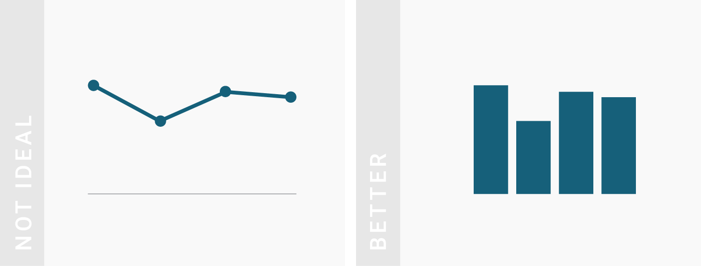
TIPS 3:展示大量数据或者时间序列时
如果某一类数据本来就不多的情况下,柱状图可能会更合适。
Line charts work really well for a high number of values or values with different time intervals. If you only have a few values of one category at the same time intervals, consider a column chart instead.
II. 怎样制作更好的线形图?
How to make line charts better?
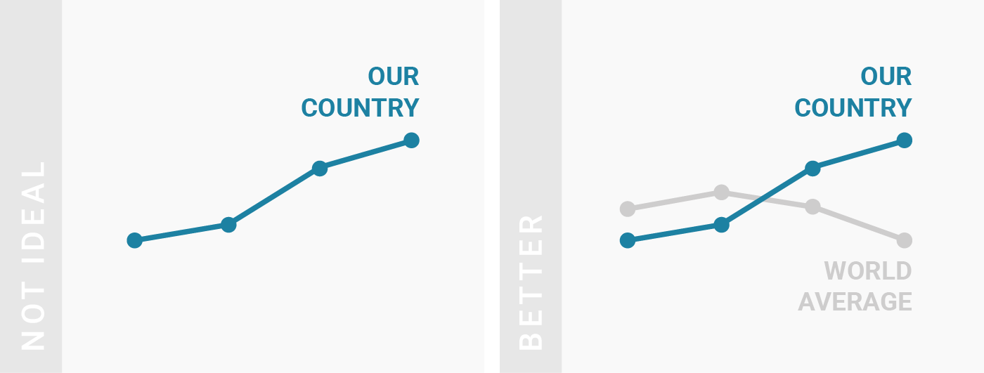
TIPS 1:增加对照
Consider adding comparison data to your line chart.
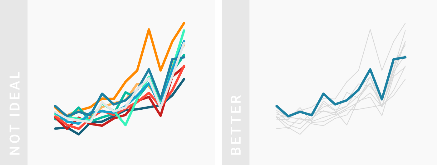
TIPS 2:用颜色、宽线、虚实线突出最重要的数据
Use colors, line width and line dashes to make your most important values stick out.
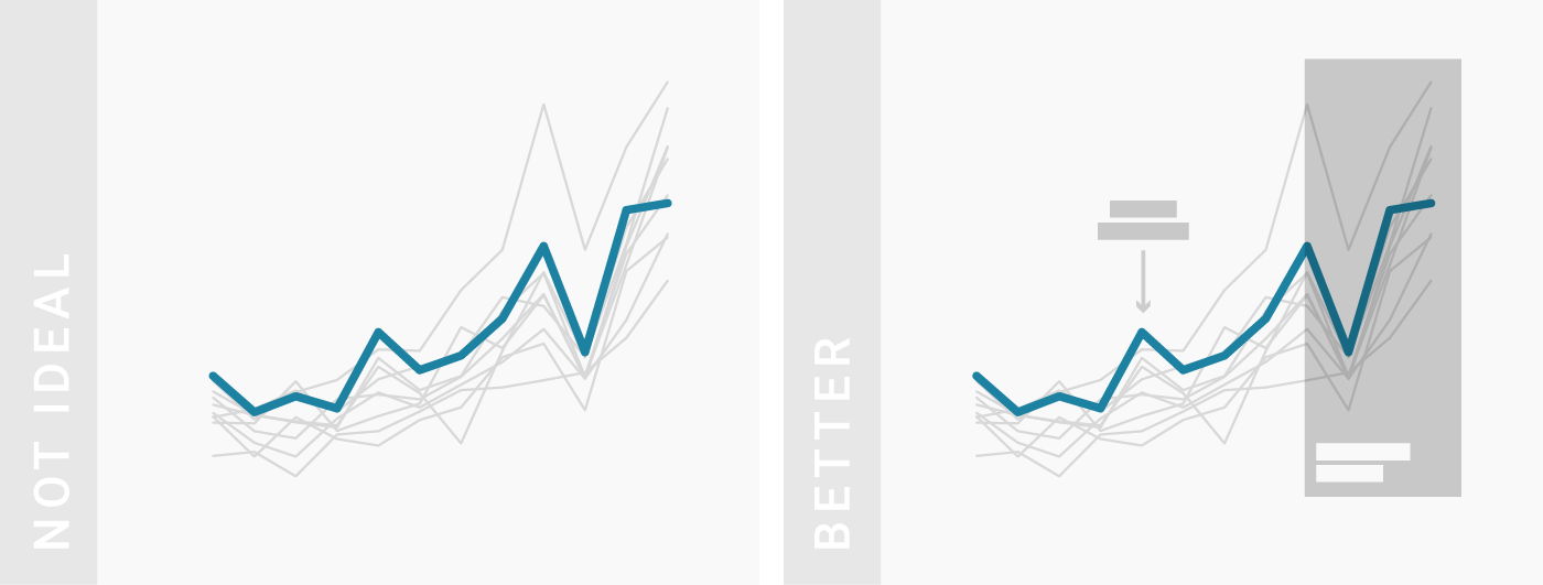
TIPS 3:借助批注和线框来增加说服力
Consider using annotations and highlight ranges to add explanations to your charts.
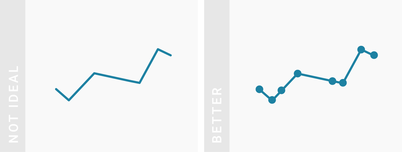
TIPS 4:借助线条和标记来说明数据的有效范围
Consider adding line symbols to make clear which dates your data covers.
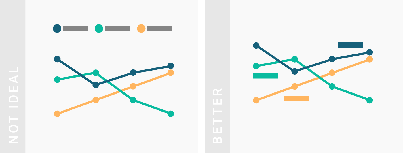
TIPS 5:不要使用默认的自动调整标签位置选项
Consider turning off automatic labeling and place the labels yourself.
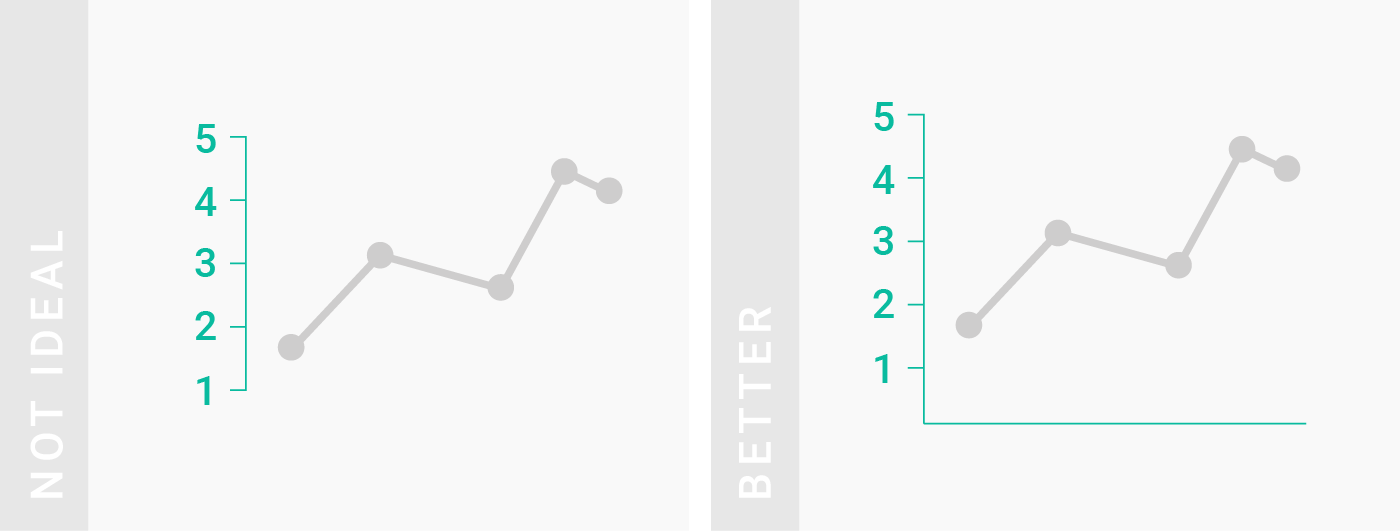
TIPS 6:将纵轴延伸到零点
Consider extending your vertical axis to zero.
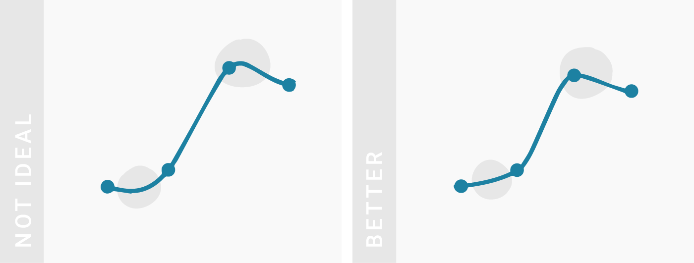
TIPS 7:谨慎使用光滑曲线
光滑曲线(也被成为“曲线插值”)可以让读者对关注整体趋势而非单个点的关注。如果数据确实就是不断变化的,这可能很有意义。然而,曲线也会扭曲读者对数据的视觉印象。
Pay attention when using smooth lines. Smoothing out your lines (“curved interpolation”) is a good way to take away the attention of individual points and to the overall trend. If your data changes continuously in the real world, this can make a lot of sense. However, curves can distort the visual impression of your data.